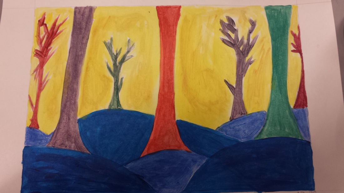
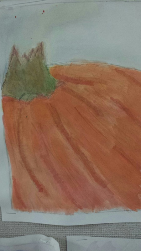
The painting was supposed to be of spooky tress but i felt a brighter calling towards it. I went with the Dr. Seuss theme because I wanted to use primary colors and have an unnatural background. I used watered down acrylic paint but the base to every color was blue (except the yellow). For the yellow I didn't want plain yellow i wanted a light brown effect coming out and I think that it turned out very well.
This dreamtime represents a lot in my life. I did the fish because I fished a lot when I was younger and it just shows how there are so many fish in the sea. The elements that I used are texture because I used colored pencils, markers, and paint. Also I used size because everything is not the same size.
My print turned out really well. It took a little longer then I expected. It doesn't look very good in just black ink so the gold make the flower pop.
This ink drawing turned out really well. I used a lot of values. I tried to create a dark affect in the background. I also used cross hatching and stippling.
This painting of myself really represents me well because I am always wearing my hat. I think the different values in color and light and dark works really well with the painting. I also think that that it was a really good painting and has many different shades.
This painting is a still life of a pumpkin. I think the details and the shadows were displayed okay with the lines in the paint. But there are different values and layers that got painted into it to make there have space. The stem was the hardest to paint because of the off color and different shape.
This hallway drawing was kind of difficult to do because I had to create space behind space. It was also easy in the aspect that everything was in perspective and it was mostly squares I had to draw. I didn't finish the drawing because I ran out of time and had to keep restarting to make it to scale. I really like the drawing because it has a certain value to it.
So this is mine and Roy's drawing next to each other and I have to say that Roy put in a lot of detail to his drawing so mine looks bad next to his. But the lightness of the lines complement each other. If Hannah's drawing was next to ours it would look complete.
This room drawing is very basic but has a twist. I did like two different rooms in one drawing. The first room has a rug and a shelf and the second hidden room has a tree drawing that really speaks to me. It reminds me of the great northwest. And the room it's self is very clean and sharp.
This leaf drawing is very unique because it's got a touch of me in the splatter paint. I think I got the darkness and lightness of the leaves on point. Also there is not a lot of white space so the leaves take up most of the paper.
|